BiteClub
Case Study
Concept, Branding, Mobile UX
BiteClub is a subscription-based pet food application designed to enhance the well-being of your furry companions. Key features include tailored dietary recommendations, personalized doggie bags, and a seamless order scheduling system that provides pet owners with a hassle-free solution for their furry friend’s nutritional needs.
My Role
Entire product design from research to conception, visualization, and testing.
Duration
March 2023 to July 2023
Completed while in the Google UX Certificate program.
Project Overview
Problem
Busy pet owners need more affordable and convenient options for purchasing supplies and trying new products.
Goal
Design an app that provides users with options, personalized recommendations, and consistent deliveries based on their pets' needs.
User Research
Before beginning the design process, we needed more information on our users. Our primary focus was to better understand the users we are designing for, their goals, and their pain points. We conducted user interviews to learn about their needs and preferences.
Research Goals
To understand the challenges people face when caring for their pets.
To understand what it looks like to care for a pet (what they require).
To identify how people decide what to buy for their pets.
Key Insights From User Research
Users want more options tailored to their pets’ dietary needs
They would like more variety of flavors/brands to choose from, including offerings from small businesses
When purchasing food online, they would like the option of scheduling shipments
User Persona
Competitive Analysis
The goal of conducting our competitive audit was to compare the experience of ordering food from our competitor’s app. We looked at the type and quality of the products they offer, how they position themselves in the market, and their overall strengths and weaknesses.
The pet supply companies we looked at gave us insight into what works and where there are gaps in the market. We looked at a delivery service and a subscription box service as indirect competitors to see how they position themselves as providing a service rather than a product.
Direct Competitors: Chewy, Bark Box, and Petco
Indirect Competitors: Instacart, Ipsy
Key Insights From Market Research
Competitor Strengths
easy navigation, thoughtful features, in-person availability (convenience)
Competitor Weaknesses
clunky mobile experience, improve accessibility features, too many irrelevant pop-ups/distractions
Gaps in the Market
the ability to try sample-size portions, create custom lists, tailor experience to your pet’s diet
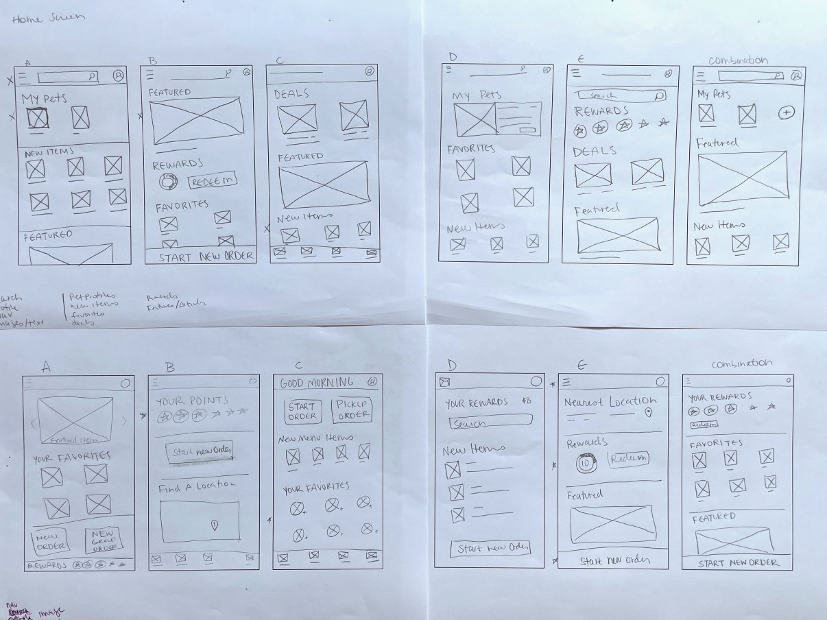
Wireframes
Paper wireframes helped prioritize the elements to include for each screen and how to best showcase the sections.
I created digital wireframes in Figma to visualize the structure of the app. As I worked through the wireframes, it became clear that some elements in the design didn’t add substance to the experience. For example, capturing your pet’s activity and diet didn’t have the same effect as asking specific questions like what type of food they like, your wellness approach, and pinpointing diet restrictions.
Usability Insights & Solutions
I conducted two rounds of usability studies. Findings from the first study helped guide the designs from wireframes to mockups. The second study used a high-fidelity prototype and revealed what aspects of the mockups needed refining.
It was made clear that users didn’t understand some key phrases used throughout the app. For example, ‘Doggie bags’ are an element of the brand, and users didn’t know what that meant. We added intro pages to explain the product’s key features.
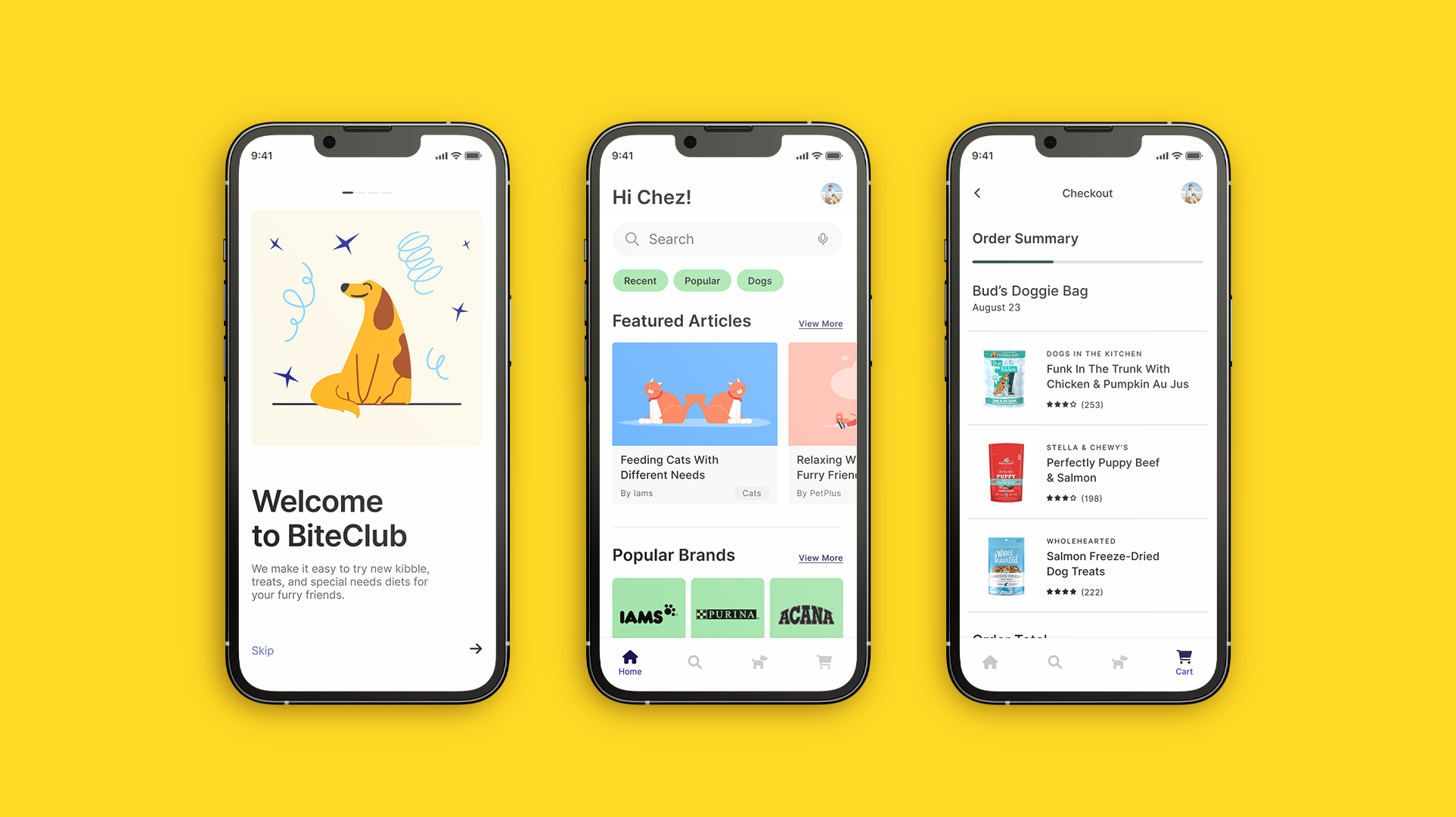
High-Fidelity Prototype
The final high-fidelity prototype presents a cleaner user flow for customizing the pet profile. It uses refined color choices, clear navigation, and informative copy language.
Key Mockups
Accessibility Considerations
1
Used an intentional color palette that indicates the hierarchy of information and provides contrast between text and background.
2
Used clear and consistent indicators such as icons, text labels, and font weight for visual cues to make navigation easier.
3
Provided explanatory text for links and images.
4
Built a type system with a meaningful sequence.
Takeaways
Impact
The app is able to capture the details of a user’s pet and provide customized recommendations based on the data.
What I Learned
While designing this app, I learned that these are living products, especially while they are being created. They are constantly evolving and solving new problems throughout the journey. It’s crucial to stay flexible along the way.